 whatblast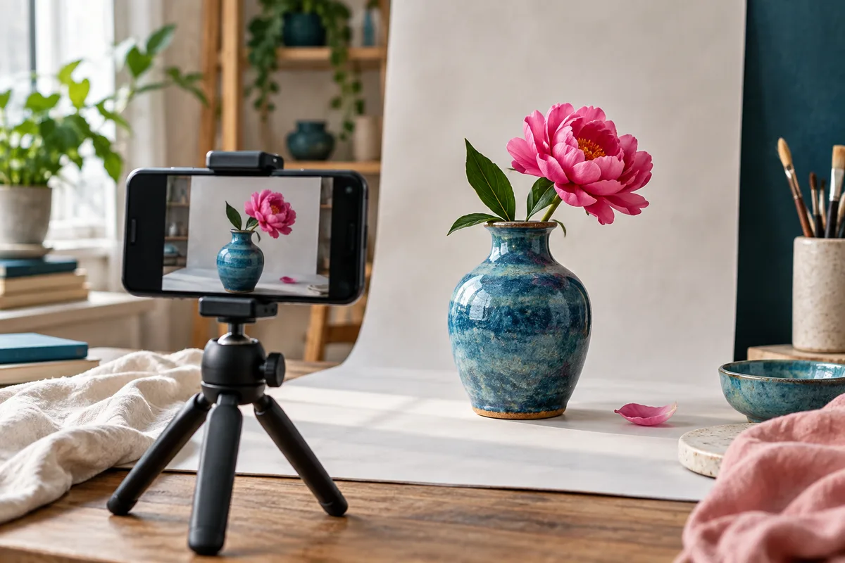
Design WhatsApp campaign media for a small screen and a distracted reader. Use one focal point, accurate imagery and very little text. Keep essential information in the message, export an appropriate file size and test the received version on real devices before sending.
A beautiful image can make a product easier to understand. It can also hide the offer behind tiny lettering, decorative clutter and a file that takes too long to load. Good campaign design starts with the communication problem. Decide what the image or video adds that the accompanying text cannot explain as efficiently.
Give the asset one clear purpose
Choose whether the media should show the product, demonstrate an action, explain a comparison or establish a setting. Trying to do all four at once often produces a miniature brochure. A chat preview is not a generous canvas for every detail the business wants to mention.
Write a simple creative brief: the intended audience, the main thing they should notice and the action supported by the asset. Include the real product or service details that must remain accurate. This keeps visual decisions connected to the campaign rather than to whichever effect looks fashionable today.
If text already explains the message perfectly, media may be unnecessary. A booking reminder can be clearer without an image. A new furniture finish, on the other hand, may be difficult to understand without a photograph. Choose the format because it helps the recipient, not because every campaign needs a picture.
Make the main subject large enough
Use a clear focal point and remove competing objects. For a product image, show the product at a useful scale with enough context to understand it. A chair photographed from the other end of a beautiful room may communicate atmosphere while revealing very little about the chair.
Check the image at the size it will appear in the chat preview. If the subject becomes a tiny shape, crop more tightly or simplify the composition. Keep important details away from edges that may be cropped by previews or different aspect-ratio treatments.
Use negative space deliberately. It can help the product stand out, but excessive empty space may make the important content too small. The best balance depends on the subject and the receiving interface, so test the actual delivered asset rather than trusting only the design canvas.
Keep text short and readable
If the image contains words, use a short headline and a clear hierarchy. Avoid long paragraphs, multiple fonts and decorative text effects that reduce legibility. High contrast matters more than a subtle colour combination that looks elegant only on a large monitor.
Do not place material conditions exclusively inside the image. The recipient should be able to understand important dates, prices or limitations from readable message text or the linked page. Tiny legal-looking copy is not a practical solution to an overcomplicated offer.
Check the design with larger system text settings and on a smaller phone. While image text does not resize like ordinary text, this test helps reveal how dependent the message is on the graphic. If the asset is essential to comprehension, provide an equivalent explanation in the message.
Use accurate, natural imagery
For specific products, prefer photographs that honestly show what the customer will receive. Keep colour, proportions, materials and included accessories accurate. Editing can improve lighting and clarity, but should not create a different product. A beautiful image that produces a disappointed buyer has failed commercially.
Realistic context can help people understand scale and use. A hand holding a mug, a bag beside ordinary objects or a chair in a believable room can be more informative than a floating product on an elaborate fantasy background. Avoid visual clutter that makes the product hard to inspect.
Generated imagery can work for editorial concepts, illustrative scenarios or mood, provided it does not misrepresent a real item or customer. Label illustrations where the distinction matters. Do not use fictional portraits as evidence of real endorsements or invented campaign results.
Make video understandable without sound
Many people will encounter a video without listening immediately. Show the central action clearly and include concise captions when speech carries important information. Avoid opening with a long logo animation while the useful demonstration waits offscreen.
Plan a simple sequence: establish the subject, show the action and make the result clear. A product demonstration might show how an item opens, fits or works. Keep each shot long enough to understand, and avoid rapid effects that make an ordinary task look more complicated than it is.
Use audio thoughtfully, but do not make it the only carrier of meaning. Check music and footage rights before publication. If the video includes speech, verify captions manually. Automatic captions can turn an ordinary product name into an unexpected new species of kitchen appliance.
Balance file size and useful detail
Export at dimensions appropriate for the intended display rather than sending an unnecessarily large original. Compression should preserve the details that matter: product texture, readable type and the action shown in video. Inspect the exported file, not just the editing project.
Use a format supported by the sending setup and check its current limits. Do not assume that every provider accepts the same image, video or document size. If a file fails, investigate the format and dimensions before repeatedly attempting to upload it.
Test under a slower connection where practical. An image that eventually looks excellent may still provide a poor experience if the reader sees only a loading state. Consider whether a simpler image or a link to a fast product page would communicate the same idea more effectively.
Prepare the preview and destination together
The message, media and landing page should feel like parts of the same journey. Use consistent product imagery and wording so the visitor recognises what they opened. A campaign showing a blue product should not land on an unrelated category page dominated by another colour.
Check link previews where the sending method displays them. The page’s title, description and social image should accurately represent the destination. A stale preview can make a current campaign look unfinished even when the page itself is correct.
Keep the link destination stable during the campaign. If the page changes materially, review the message and scheduled sends too. Visual consistency is helpful, but factual consistency matters more: price, availability and conditions should agree across every step.
Build a reusable export checklist
- One clear focal point at phone-preview size.
- Accurate product or service representation.
- Readable contrast and minimal image text.
- Essential information available outside the image.
- Supported format, dimensions and file size.
- Video understandable without sound where possible.
- Captions checked and media rights confirmed.
- Important content protected from likely cropping.
- Message, preview and destination aligned.
- Actual received asset inspected on more than one device.
Save export settings with the final asset so future campaigns can use a reliable starting point. Keep editable originals separately from delivery files. This prevents repeated recompression and makes it easier to update a price or date without rebuilding the design from a screenshot.
Name files clearly by campaign and version. “Launch-blue-bowl-final-approved” is more useful than “image-new-2”. The naming convention does not need to be elaborate, but the team should be able to identify the approved asset without asking the designer every time.
Test the design with a real question
Show the asset briefly to someone unfamiliar with the campaign and ask what they noticed. Then ask what action they think the business wants them to take. If their answer differs from the brief, simplify the hierarchy before adding more explanation.
When comparing designs, keep the audience and offer consistent where possible. Decide whether you are testing the product crop, headline or format. Changing all three at once may produce a winner without teaching you why it worked.
Review practical outcomes, not only aesthetic preferences. A design that people describe as beautiful may still generate confused questions. The message-writing guide helps align the text, while the testing guide covers the final delivery checks.
Frequently asked questions
Should every image include the business logo?
Use branding where it helps recognition, but do not let it crowd the main subject. The sender identity and message text also identify the business. A small, clear brand treatment is usually more useful than a large logo competing with the product.
Is a larger image file always better quality?
No. File size depends on dimensions, format, compression and visual complexity. Export for the actual use and inspect the result. An oversized original can slow delivery without adding visible detail on a phone, while excessive compression can damage important text or texture.
Can I use AI-generated product images?
Only when the result accurately represents the product and the use is appropriate. Check every material detail rather than assuming a convincing image is correct. For editorial illustrations, make the illustrative role clear and avoid presenting invented people or scenes as verified customer evidence.
How much text belongs in a campaign image?
Usually less than the first draft contains. Use a short headline if it helps, and put supporting information in readable message text or the destination page. If the image needs several paragraphs to explain itself, reconsider the message or split the content into a clearer format.